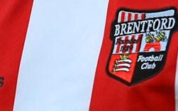
A new Brentford crest, which will be rolled out for the start of the 2017-18 season, has been revealed by the club with that replacing the one that was brought in back in 1993.
The Middlesex arms and shield shape of the one put out 23-years ago will be replaced by one Brentford chief executive Mark Devlin has told the Official Website will make it a more ‘recognisable, iconic and practical to use’ logo.
A simple honeybee with the club name and 1889 founding year; will now be used.
‘It’s always an emotive subject when a club decides to change something as important as its crest but part of our club’s philosophy has always been about moving with the times and improving as we go. Like everything we do at Brentford, this isn’t change for change’s sake, there is always a reason behind it and that reason is to give the club a clearer and more recognisable crest that will help us grow off the field.’
Devlin said this is ‘evolution’ and ‘not revolution’ making the new one fit for purpose whereas the old wasn’t, adding.
‘We all recognise the old crest wasn’t really fit for purpose in a digital age, where impact has to be instant and that’s part of the reason we’ve changed. This is not revolution, it’s part of the club’s evolution. In the next few years, we will be taking huge strides with the move to a new stadium and the change of crest to a simpler, more striking image is part of that progress.’


